Safari 11 Introduces Improved UI for Certificate Warnings

Earlier this year at its Worldwide Developer Conference (WWDC), Apple announced Safari 11 and gave audiences a preview of the new features for the browser, including a redesigned error pages for SSL certificate warnings.
Safari 11 was officially released last week for macOS and ships with the latest version, High Sierra.
The new certificate warning UI is an important improvement for Safari, and the first major change to its security UI in years.

Understanding the Importance of Security UI
Certificate validation—the process of evaluating if a certificate is trusted—is one of the primary tasks a browser performs to establish an HTTPS connection. This includes a number of steps, including checking the digital signature, ensuring the certificate is valid for the hostname you are connecting to, and evaluating the certificate chain. From a technical standpoint, all major browsers handle validation correctly.
However, browsers need to provide more than technical competence. Invalid certificate warnings with jargon-riddled error messages, coupled with a UI that makes it easy to ignore certificate errors, create security risks.
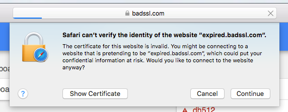
Browsers serve their user and have a responsibility to consider how the UI they provide enables their users to make a safe decision. In previous versions of Safari, when a user encountered a certificate error, the certificate viewer would open and include an error message, but the wording was unclear and it was not user-friendly. Here is the old error UI from Safari versions 9 and 10:

For the everyday, non-technical audience, this UI did not enable them to make a safe choice.
Clicking “Show Certificate” exposed the certificate chain—information which most users don’t know how to use—and included a message that was more specific about the error.
In some cases, those messages were confusing or downright misleading. For self-signed certificates, which a normal user should never use, the message said, “this certificate has not been verified by a third party,” which does not communicate the risk of using a completely untrusted certificate.
Safari had been using that UI since at least version 7, released in 2013. At that time, the effectiveness of security UI was rarely studied and not well understood. It is only in the last few years that we have seen data-driven improvements in the security UI of web browsers.
Creating Better Warnings
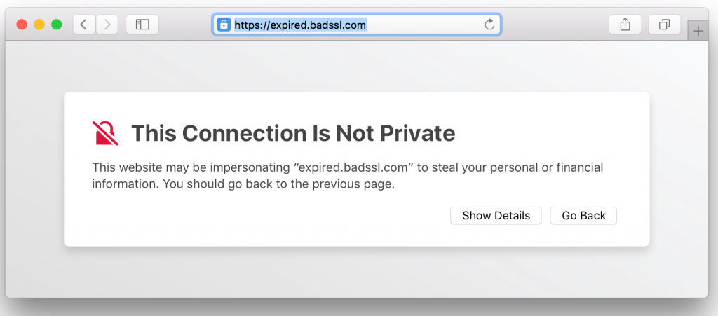
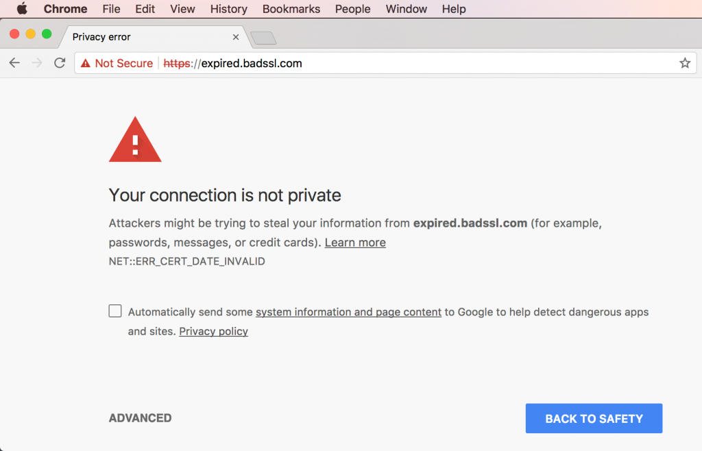
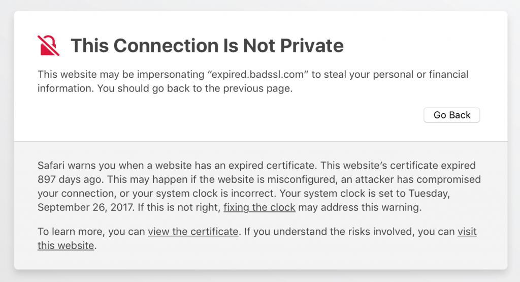
Safari 11’s new UI bears a strong resemblance to Google Chrome’s:

Safari 11 uses a full-page error, similar to what Chrome and Firefox have been using, and borrows a few key design features.
Chrome redesigned its certificate warning UI in 2015. Supported by an extensive research study, Google’s engineers found that an “opinionated design”—which visually prioritizes the desired choice—led to a significant increase in adherence to the warning. Google’s redesigned UI, which premiered in Chrome 37, had an adherence rate of 58 percent, compared to the previous design’s 31 percent.
Chrome and Safari 11 use opinioned design in the same way: both hide the undesired choice (proceeding past the warning). You first have to click a button to reveal the option to proceed. In Chrome the button is named “Advanced,” and in Safari 11 it’s “Show Details.” The option to proceed past the error is then a small and visually undistinguished hyperlink.
Safari’s new error page states, “You should go back to the previous page.” This non-technical advice gives the user clear guidance on what they should do in most circumstances.
Safari 11’s certificate warning UI should yield similar improvements to what Google Chrome’s team achieved. By improving adherence rates, Apple is helping users stay safe, and combat “warning fatigue,” a dangerous effect of poorly designed warnings.
Warning fatigue occurs when a user sees a warning too often and believes it is unimportant or incorrect. In addition to frequency, warning fatigue can also occur when a user does not understand what a warning message means.
Safari 11 is available now through the App Store for macOS versions El Capitan (10.11.6) and newer.


